QALYs and DALYs
Here is a short note on DALYs and QALYs. I read some papers dealing with QALYs, which are Quality Adjusted Life Year. They are used in cost-effectiveness studies, or quality-of-life research, as a primary or secondary endpoint (or efficacy criterion). The EQ-5D questionnaire is one such tool to measure QALYs. It is a measure of the perceived utility of a medical treatment corresponding to a gain of one year of life. That way, it allows to combine the idea of a survival function with an indicator of quality of life. Quoting Wikipedia, “The QALY is based on the number of years of life that would be added by the intervention. Each year in perfect health is assigned the value of 1.0 down to a value of 0.0 for death.” A good reference is: Prieto, L and Sacristán, JA (2003). Problems and solutions in calculating quality-adjusted life years (QALYs) . Health and Quality of Life Outcomes, 1: 80.
The DALYs are another unit of measurement that stands for Disability Adjusted Life Years. In short, it is computed as the sum of years of potential life lost due to premature mortality and the years of productive life lost due to disability (WHO). A brief sketch of death and DALY estimates for 2004, by age and gender, is available on WHO website (in Excel format, sic.). This is part of the WHO effort to collect and summarize data on the Global Burden of Disease (GBD). One of the aims of the GBD study was to develop “comprehensive internally consistent estimates of how many people died of each major cause worldwide.” Deaths were classified into: (I) Communicable, maternal, perinatal and nutritional conditions; (II) Noncommunicable diseases; and (III) Injuries. More information can be found at the following addresses:
- http://www.globalburden.org/
- Global Burden of Disease and Risk Factors — The Global Burden of Disease 2000 project: aims, methods and data sources, Murray et al.
As a sort of illustration and a way to learn ggplot2 map layout, here is some R code I used to make the following picture
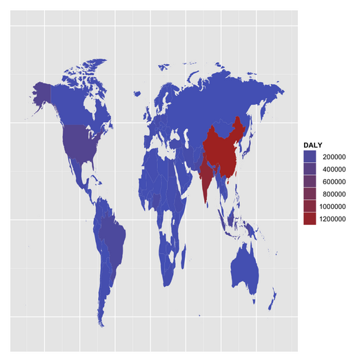
This really is a toy example with ggplot2, and that does not reflect the actual DALYs distribution worldwide.
library(gdata)
library(maps)
library(ggplot2)
gbd <- gbddeathdalycountryestimates2004.xls
gbd.src <-
"http://www.who.int/entity/healthinfo/global_burden_disease"
gbd1 <- data.frame(t(read.xls(url(paste(gbd.src, gbd, sep="/"), sheet=5)[c(5,11),8:199]))
colnames(gbd1) <- c("Country", "DALY")
gbd1$Country <- sapply(gbd1$Country, as.character)
gbd1$DALY <- gsub(",", "", gbd1$DALY)
# need to fix spelling for some countries
wm <- map_data("world")
wm <- merge(wm, gbd1, by.x="region", by.y="Country", all.x=TRUE, sort=FALSE)
wm <- wm[order(wm$order),]
wm$DALY <- as.numeric(wm$DALY)
p <- ggplot(aes(x=long, y=lat), data=wm) +
     geom_polygon(aes(group=group, fill=DALY)) +
     ylim(-60, 100) +
     opts(axis.ticks=theme_blank(), axis.text.x=theme_blank(),
          axis.text.y=theme_blank(), axis.title.x=theme_blank(),
          axis.title.y=theme_blank())
p
Of note, there are 234 unique countries available in the world database, whereas only 192 countries are available in the WHO data file, of which 145 match the former classification. There’s room for cleaning, especially given that the USA and Russia are missing : smile : (Russia is still know as USSR in the maps package, while it is Russian Federation according to WHO!). Recoding I used are in the attached file, recode.txt. The patch can be applied as follows:
rec <- read.table("recode.txt", header=FALSE, sep="/", strip.white=TRUE)
for (i in 1:nrow(rec)) {
  idx <- which(as.character(rec[i,1])==gbd1$Country)
  if (length(idx)>0) gbd1$Country[idx] <- as.character(rec[i,2])
}
Note that it is not perfect because some countries, like Armenia which was part of USSR, would still not be identified properly on the map. Anyway, I guess it’s just a matter of choosing the right map, at least a more actualized one. The above code leaves us with 11 mismatches.