Statistical charts using Mathematica
This is yet another post on Mathematica where I am trying to document my journey through statistical analysis using this very beast. In previous posts, I show how to draw interaction plots using Python or Stata. Now it’s time to see what we can do with Mathematica.
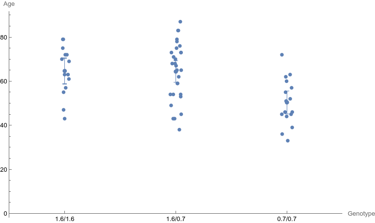
First we will make a little digression with a very basic plot of group means with confidence intervals. The HypothesisTesting package provide the MeanCI function which returns a list of lower and upper 95% confidence limits. Let’s load the same genotype data as before, and I’ll keep using plain lists rather than associations:
d = Import["polymorphism.dta", "Dataset"];
ds = Flatten /@ List @@@ Normal @ d;
Then, we easily get our desired confidence intervals: (output is prefixed with =>)
Needs["HypothesisTesting`"]
cis = Table[{x[[1, 3]], MeanCI[x[[All, -2]]]}, {x, GatherBy[ds, #[[3]]&]}]
=> {{1., {58.1871, 71.0986}}, {2., {59.3357, 69.423}}, {3., {44.706,
   56.044}}}
The values {1, 2, 3} correspond to the genotype 1.6/1.6, 1.6/0.7, and 0.7/0.7, respectively.
This is fine, but to manage error bars in a scatterplot, it is now recommended to use ListPlot instead of ErrorListPlot (as of Mathematica v12). Moreover, rather than creating a list with two values (the lower and upper limits of the 95% CI), why not use the Around function, which works directly with ListPlot? Here is my take, considering a Gaussian distribution rather than a Student t distribution:
ErrorMarginNormal[x_, p_] := Quantile[NormalDistribution[0, 1], 1 - p/2] * StandardDeviation[x]/Sqrt[Length[x]]
MeanCINormal[x_] := Around[Mean[x], ErrorMarginNormal[x, .05]]
cis = Table[{x[[1, 3]], MeanCINormal[x[[All, 2]]]}, {x, GatherBy[ds, #[[3]]&]}];
=> {{1., Around[64.64285714285714, 5.856898699924958]}, {2., Around[
  64.37931034482759, 4.825889674452653]}, {3., Around[
  50.375, 5.212899350342959]}}
From there on, it’s just a matter of Listplotting the whole thing:
ddn = MapAt[# + RandomReal[{-.05,.05}]&, ds, {All, 3}];  (* jittering on x-axis *)
xlabs = {{1, "1.6/1.6"}, {2, "1.6/0.7"}, {3, "0.7/0.7"}};
Show[ListPlot[ddn[[All, {3, 2}]], Ticks -> {xlabs, Automatic},
  AxesLabel -> {Genotype, Age}, PlotRange -> {{0.5, 3.5}, Automatic}],
  ListPlot[cis]]
I did not find an option to add a bit of jittering on the x-axis, hence the derived data table ddn where I added random noise on the abscissae. Results is shown in the left panel below.
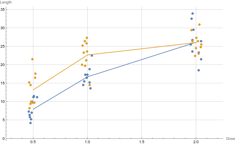
As an another illustration of the flexibility of Mathematica regarding statistical graphics, here is our interaction plot from the previous posts.
d = Import["../data/toothgrowth.dta", "Dataset"];
ds = Flatten /@ List @@@ Normal @ d;

avg = Table[{x[[1, 3]], Mean[x[[All, 1]]]}, {x, GatherBy[ds, #[[{2, 3}]]&]}];

ddn = MapAt[# + RandomReal[{-.05,.05}]&, ds, {All, 3}];
ddn = SplitBy[ddn, #[[2]]&];

Show[ListPlot[ddn[[All, All, {3, 1}]], AxesLabel -> {Dose, Length},
  PlotRange -> {{0.25, 2.25}, Automatic}, GridLines -> Automatic],
  ListPlot[Take[avg, 3], Joined -> True, PlotStyle -> ColorData[97][1]],
  ListPlot[Take[avg, -3], Joined -> True, PlotStyle -> ColorData[97][2]]]
The result is displayed in the right panel of the above figure.
♪ Joan As Police Woman • Holiday