Networks, graphs and visualization
Before talking about social networks or graph visualization, let’s look at the article written by Matthew Bloch and Jonathan Corum for the New York Times (May 5, 2008): Mapping the Human Diseasome.
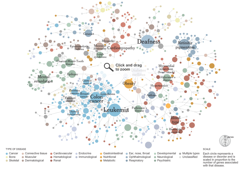
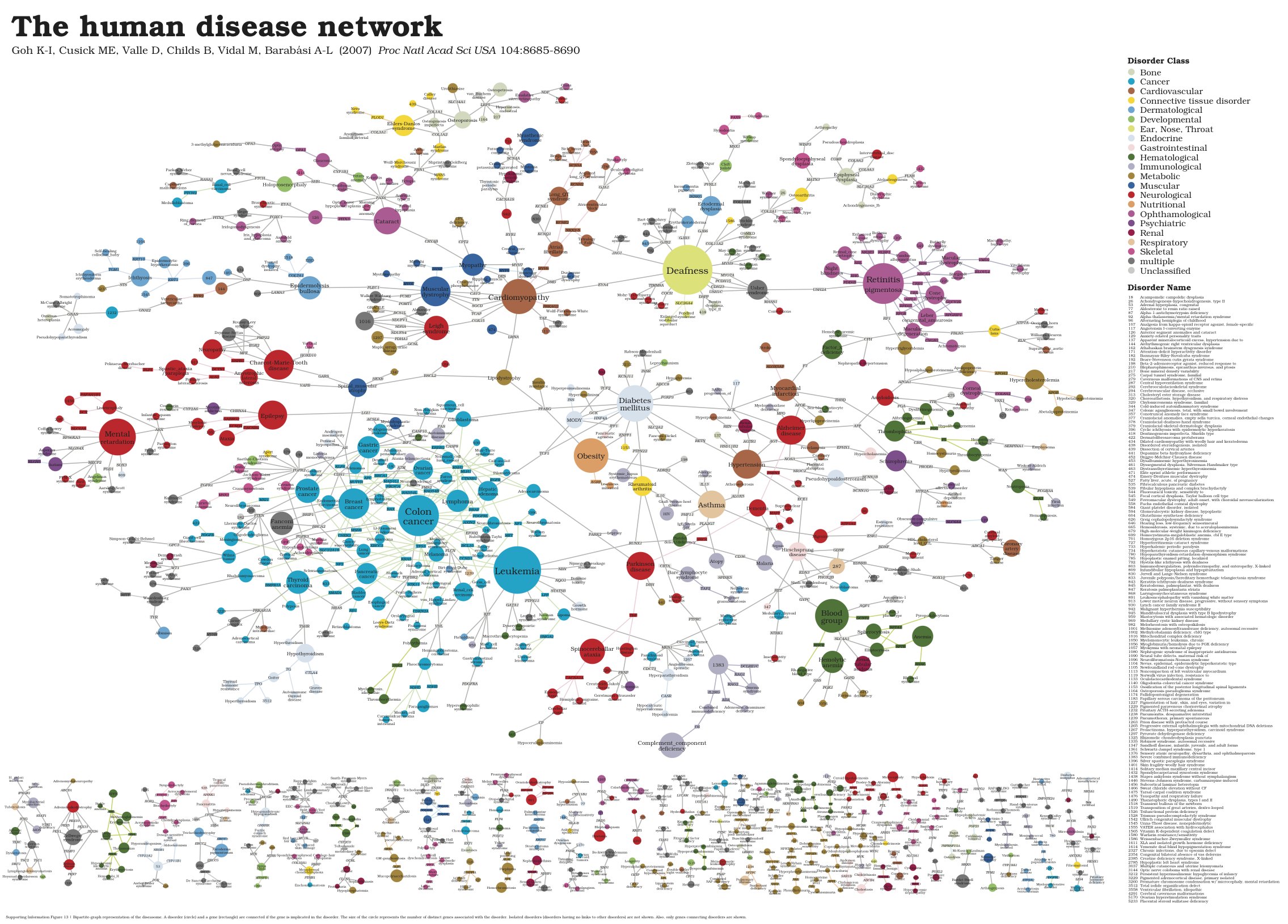
Surprisingly, this gives a very clear picture of the links between various disorders, mostly of genetic origin. This original scientific work, entitled The human disease network, has been published in PNAS and the abstract is reproduced below: Goh, K., Cusick, M.E., Valle, D., Childs, B., Vidal, M., and Barabasi, A-L (2007). The human disease network. Proceedings of the National Academy of Sciences, 104(21), 8685–8690.
A network of disorders and disease genes linked by known disorder–gene associations offers a platform to explore in a single graph-theoretic framework all known phenotype and disease gene associations, indicating the common genetic origin of many diseases. Genes associated with similar disorders show both higher likelihood of physical interactions between their products and higher expression profiling similarity for their transcripts, supporting the existence of distinct disease-specific functional modules. We find that essential human genes are likely to encode hub proteins and are expressed widely in most tissues. This suggests that disease genes also would play a central role in the human interactome. In contrast, we find that the vast majority of disease genes are nonessential and show no tendency to encode hub proteins, and their expression pattern indicates that they are localized in the functional periphery of the network. A selection-based model explains the observed difference between essential and disease genes and also suggests that diseases caused by somatic mutations should not be peripheral, a prediction we confirm for cancer genes.
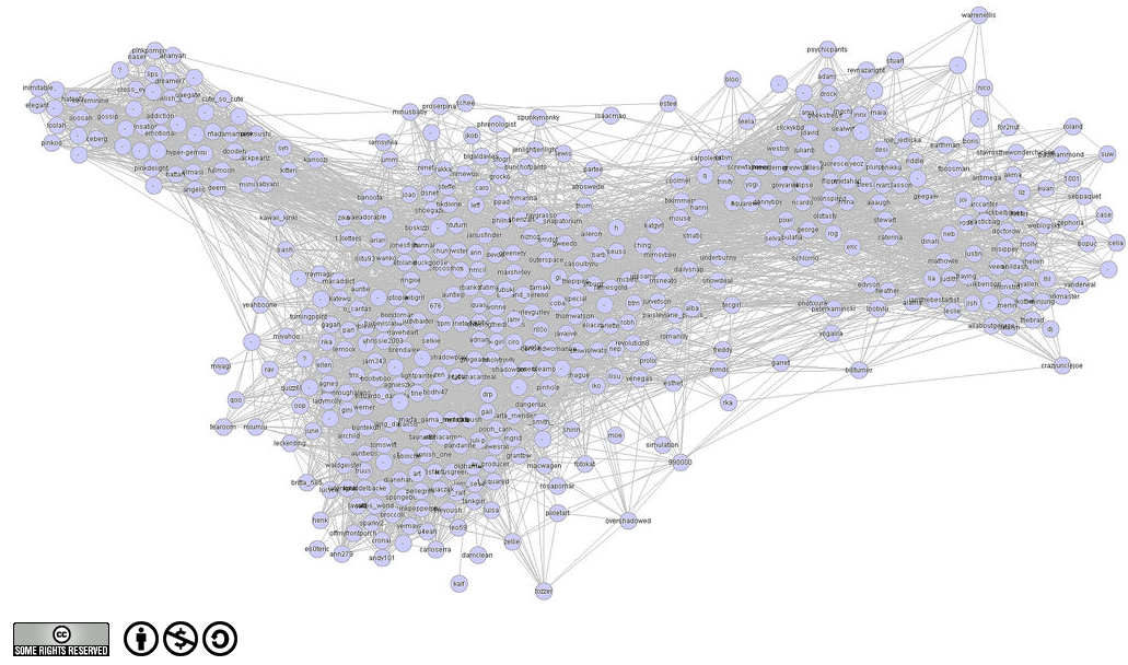
Another example of spatial representation of a connected network is the now well-known Nexus application that can access any Facebook account. More generally, social networks rely on similar facilities for geometric visualization of relationships. The following example has been found on Jeffrey Heer’s webpage:
Also, on Flickr one can found a very big network including only people with at least 50 or 10 mutual contacts. By not allowing overlaps between the nodes, the network is spread out, and relationships are made clearer. There are four very distinct clusters for the first case (50 mutuals friends).

Processing is an open-source programming language and environment allowing for dynamic graphics. I have to give it a try. It will probably save time doing some sophisticated animation of 3D data with Python and Pygame. I also heard about Prefuse, which seems basically to provide similar functionalities, albeit for Java programming.
Additional references
- visualcomplexity.com: a visual exploration on mapping complicated and complex networks
- Netvis Module: dynamic visualization of social networks
- Viégas, F.B. and Donath, J. (2004). Social network visualization: Can we go beyond the graph
- vizster: visualizing online social networks
By the way, I also found the next links very interesting. These are good examples of effective dynamic multivariate graphics: How Different Groups Voted in the 2008 Democratic Presidential Primaries and Election 2008.