Null zone vs. error bars
Maarten Boers wrote a paper entitled Null bar and null zone are usually better than the error bar to compare group means in graphs. Frank Harrell also mentioned null bars in one of his technical articles on his website if my memory serves me right, but I can’t get my hands on it again. Null bars depict the range within which the means of the groups fall if the null hypothesis cannot be rejected at the selected $\alpha$-level. Considering a two-group comparison, it reflects $\bar X \pm \tfrac{1}{4} \text{95% CI}$ where $\bar X$ is the the grand mean. Hence, the range covered by the null zone amounts to half the CI for the difference in means.
For one I always preferred displaying confidence intervals to standard error or standard deviation, even in the case of ANOVA design,1 with the exception of standard error of measurement in psychometrics. The null bar is not that much different except it is centered on the grand mean and, for large sample, it is equivalent to $\bar X \pm \text{SE}_\text{d}$. I recently tried to circumvent the problem of frequentist inference using Bayesian approaches, which are common in molecular phylogenetics, even if Bayesian credible intervals are not stricly equivalent to frequentist confidence intervals.2
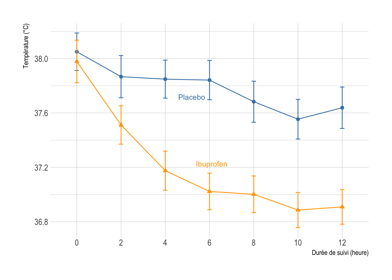
I found no R package to plot null zone like in Figure 3 of the aforementioned paper. Here is a quick and dirty R script that mimics null zone for a line graph using data that I discussed in an old handout of mine for the analysis longitudinal data. First, let’s load and plot the data.
library(Hmisc)
library(ggplot2)
library(hrbrthemes)
library(directlabels)
library(data.table)

options(digits = 6, show.signif.stars = FALSE)
hrbrthemes::import_roboto_condensed()
theme_set(theme_ipsum(base_size = 11))

sepsis <- foreign::read.dta("sepsis.dta")
sepsis$treat <- as.factor(sepsis$treat)
sepsis$id <- factor(sepsis$id)
sepsis.long <- melt(data.table(sepsis), measure.vars = 8:14, id.vars = 1:2)
celsius2fahr <- function(x) (x-32) / 1.8
sepsis.long$value <- celsius2fahr(sepsis.long$value)

d <- with(sepsis.long, summarize(value, llist(treat, variable), smean.cl.normal))

p <- ggplot(data = d, aes(x = variable, y = value, shape = treat, color = treat)) +
       geom_point(size = 2) +
       geom_line(aes(group = treat)) +
       geom_errorbar(aes(ymin=Lower, ymax=Upper), width=.1) +
       scale_color_manual("", values = c("steelblue", "orange")) +
       scale_x_discrete(labels = seq(0, 6*2, by = 2)) +
       guides(color = "none", shape = "none") +
       geom_dl(aes(label = treat), method = list("smart.grid", cex = .8)) +
       labs(x = "Durée de suivi (heure)", y = "Température (°C)")
p
And the code that computes the null zone:
null.zone <- function(data, conf.int = 0.95) {
    x <- data[[1]]
    y <- data[[2]]
    stat <- t.test(x, y, conf.level = conf.int, var.equal = TRUE)
    m <- mean(c(x, y), na.rm = TRUE)
    se <- as.numeric(stat$stderr)
    df <- as.numeric(stat$parameter)
    ci <- m + c(-1, 1) * qt((1 + conf.int)/2, df)/2 * se
    c(Mean = m, Lower = ci[1], Upper = ci[2])
}

s <- split(sepsis.long, by = "variable")
r <- data.frame(lapply(s, function(x) null.zone(with(x, split(value, treat)))))
r
#         temp0   temp1   temp2   temp3   temp4   temp5   temp6
# Mean  38.0149 37.6909 37.5240 37.4363 37.3514 37.2299 37.2808
# Lower 37.9111 37.5864 37.4240 37.3379 37.2502 37.1326 37.1817
# Upper 38.1187 37.7954 37.6241 37.5347 37.4527 37.3273 37.3799
First call to split uses data.table, second one is base R.
dr <- transpose(r)
names(dr) <- rownames(r)
dr$x <- seq(1, nrow(dr))
p <- p + geom_ribbon(data = dr, aes(x = x, ymin = Lower, ymax = Upper), inherit.aes = FALSE, fill = grey(.3), alpha = 0.2)
p
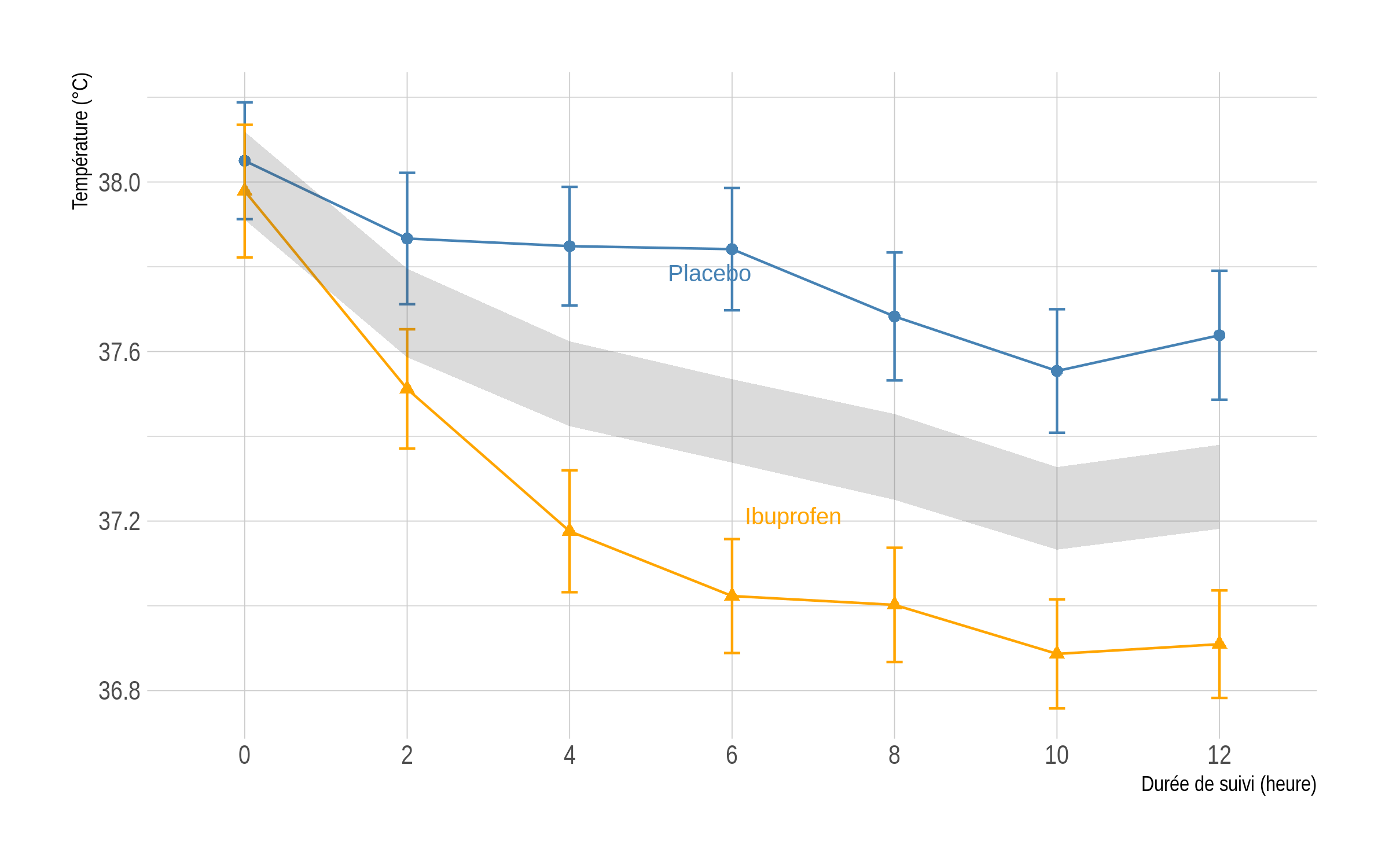
The shaded area above corresponds to the area in which the two means at each time point should lie if the null hypothesis cannot be rejected at a two-sided 5% level. Unprotected t-test assuming equal variance at each time point confirm that the two groups only differ on the first occasion:
round(as.numeric(lapply(s, function(x) t.test(value ~ treat, x, var.equal = TRUE)$p.value)), 3)
# [1] 0.499 0.001 0.000 0.000 0.000 0.000 0.000
As an alternative, one may look at the nullabor R package, which provides functions to support quantifying the significance of structure seen in plots of data.
♪ Queens of the Stone Age • I never Came
W. D. Dupont (2009) Statistical Modeling for Biomedical Researchers, Cambridge University Press. ↩︎
See, e.g., Pragmatism should Not be a Substitute for Statistical Literacy, a Commentary on Albers, Kiers, and Van Ravenzwaaij (2018). ↩︎