On choosing your colorscheme
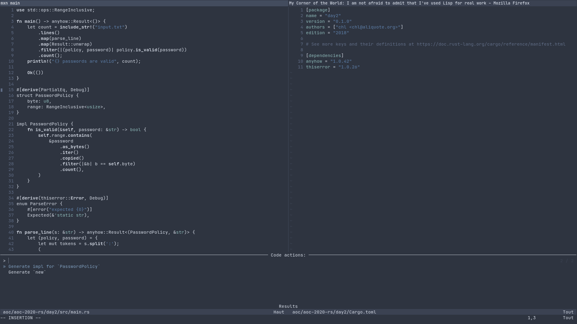
I devised my own variant of the Nord color theme for Neovim. I started with the most up to date package I found on GitHub (shaunsingh/nord.nvim) and updated the default settings, which means that I removed almost all colors. Surely Nord is a dark theme, but a pretty decent one. The only competitor to date is zenbones, IMHO. Both Neovim plugins provide Treesitter-specific highlighting, and a bunch of highlight groups for various plugins.
Previously, I devised a similar dark theme for Doom Emacs, and later on a light duotone colorscheme for Vim. Both themes rely on similar principles: highlight constant (strings and numbers, with a dimmed color for the latter) using soft (pastel) color, and “top-level” reserved keywords, e.g. functions or classes, import statements and things like that, mostly using bold typeface or a lighter color. The rest is left as is, as otherwise it becomes distracting in my view. And losing attentional sight is not a good idea when you spend most of your day in front of your editor. In this regard, Nicolas Rougier’s article, On the design of text editors, is a great read, especially section 4 on colorization:
Wayne goes a step further and denounces the use of syntax highlighting since it is a waste of an important information channel and suggest several alternative uses of color, among which, rainbow parenthesis, context highlighting, import highlighting, argument highlighting, type highlighting, etc. Instead of syntax or semantic colorization based on content, a simple alternative would be to adapt colorization to the reader, taking attentional constraints into account.
For a more extreme take, see A case against syntax highlighting. See also Your syntax highlighter is wrong.
Of course, your mileage may vary. What is important is that your colorscheme fits with your own perception and way of working, or in other words that it brings a little more to the table than no color at all.
♪ Arno • Help Me Mary

