Data tables in Python
Although Pandas is a great package to manipulate rectangular data structures, I often find myself a bit lost with its syntax (the use of loc or iloc, for instance). I learned about the datatable package a while ago, then as usual forgot about it. Here is a short overview of how I generally use it for biostatistical stuff I happen to do during my free time.
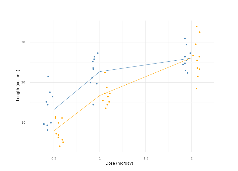
Let’s get some data first. We will consider the ToothGrowth dataset from R builtin’s, which deals with the effect of vitamin C on tooth growth in guinea pigs:
The response is the length of odontoblasts (cells responsible for tooth growth) in 60 guinea pigs. Each animal received one of three dose levels of vitamin C (0.5, 1, and 2 mg/day) by one of two delivery methods, orange juice or ascorbic acid (a form of vitamin C and coded as
VC).
Fortunately, it is available in Python thanks to the rdatasets package:
from rdatasets import data, descr
from plotnine import *
import datatable as dt

print(descr("ToothGrowth"))
dataset = data("ToothGrowth")
dataset.head()
##     len supp  dose
## 0   4.2   VC   0.5
## 1  11.5   VC   0.5
## 2   7.3   VC   0.5
## 3   5.8   VC   0.5
## 4   6.4   VC   0.5
For those familiar with the R data.table package, the syntax will be easy to grasp since it is 95% the same in the most use cases. For example, if we want to aggregate data using group means, we can proceed as follows:
d = dt.Frame(dataset)
d[:, dt.mean(dt.f.len), dt.by("supp", "dose")]
##    | supp      dose      len
##    | str32  float64  float64
## -- + -----  -------  -------
##  0 | OJ         0.5    13.23
##  1 | OJ         1      22.7
##  2 | OJ         2      26.06
##  3 | VC         0.5     7.98
##  4 | VC         1      16.77
##  5 | VC         2      26.14
## [6 rows x 3 columns]
Other variations are possible, e.g. count the number of unique or missing values, summarize the data table using mean, min or max, etc. Here are tow further examples:
d.mean()
##    |     len     supp     dose
##    | float64  float64  float64
## -- + -------  -------  -------
##  0 | 18.8133       NA  1.16667
## [1 row x 3 columns]

d[:, dt.count(), dt.by("supp")]
##    | supp   count
##    | str32  int64
## -- + -----  -----
##  0 | OJ        30
##  1 | VC        30
## [2 rows x 2 columns]
Like the R data.table package, there’s an over-optimized fread function which can handle CSV, Excel, and many more formats, while automagically detecting the appropriate type of variable. Moreover it is supposed to handle large data files.1
The H2O.ai team discusses the basic features of the datatable package on their blog: Introducing DatatableTon – Python Datatable Tutorials & Exercises. You may also like An Overview of Python’s Datatable package.
As a sequel to my previous post on seaborn and plotnine, let’s see how we can reproduce the following plot (left panel), which was made in R:
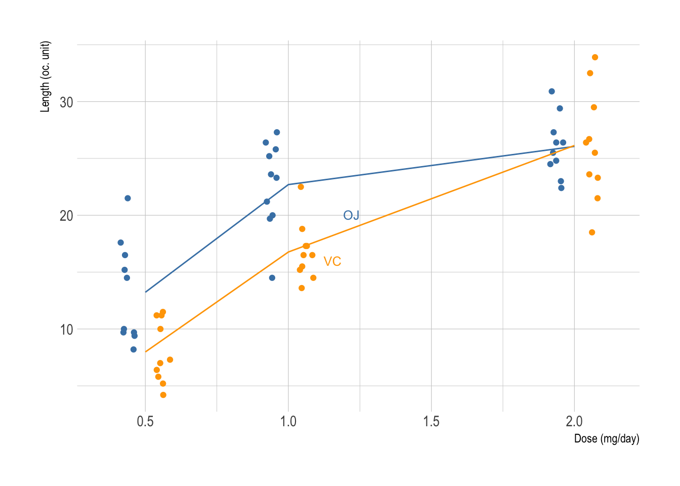
R code is shown below:2
r <- aggregate(len ~ dose + supp, data = ToothGrowth, mean)
p <- ggplot(data = ToothGrowth, aes(x = dose, y = len, color = supp)) +
       geom_point(position = position_jitterdodge(jitter.width = .1, dodge.width = 0.25)) +
       geom_line(data = r, aes(x = dose, y = len, color = supp)) +
       scale_color_manual(values = c("steelblue", "orange")) +
       guides(color = FALSE) +
       geom_dl(aes(label = supp), method = list("smart.grid", cex = .8)) +
       labs(x = "Dose (mg/day)", y = "Length (oc. unit)")
p
And here is the Python version:
r = d[:, dt.mean(dt.f.len), dt.by("supp", "dose")]
(ggplot(d, aes(x="dose", y="len", color="supp"))
  + geom_point(position=position_jitterdodge(jitter_width=.1, dodge_width=0.25))
  + geom_line(r, aes(x="dose", y="len", color="supp"))
  + scale_color_manual(values=["steelblue", "orange"], guide=False)
  + labs(x="Dose (mg/day)", y="Length (oc. unit)")
  + theme_minimal())
Not much of a difference either way. See the final result on the right panel of the previous figure.
♪ Badflower • Ghost
It would be interesting to benchamrk datatable.fread against R data.table or pandas.read_csv, like I did in my review of Exploratory Desktop. ↩︎
Shorter version for the impatient:
lattice::xyplot(len ∼ dose, data = ToothGrowth, groups = supp, type = c ("p", "a")). ↩︎