A grammar of graphics for Python
I use Matplotlib for all my plots in Python. Seaborn is becoming a really great way to use Matplotlib backend for statistical graphics. I originally thought it was only working with Pandas data frames, but it also accepts Numpy libraries as well as built-in Python types like lists and dictionaries.
Here is an example of plot from the on-line tutorial:
import seaborn
flights = seaborn.load_dataset("flights")
seaborn.relplot(data=flights, x="year", y="passengers", hue="month", kind="line")
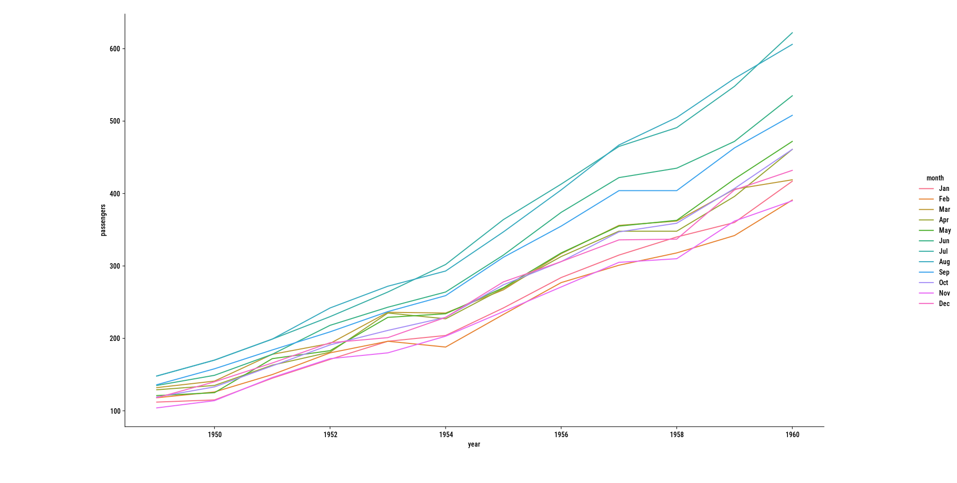
To produce this kind of plot using Matplotlib alone, it would requires a lot more instruction as we need to group data by month and use year on the x-axis. The syntax above is mostly comparable with qplot from the ggplot2 R package.
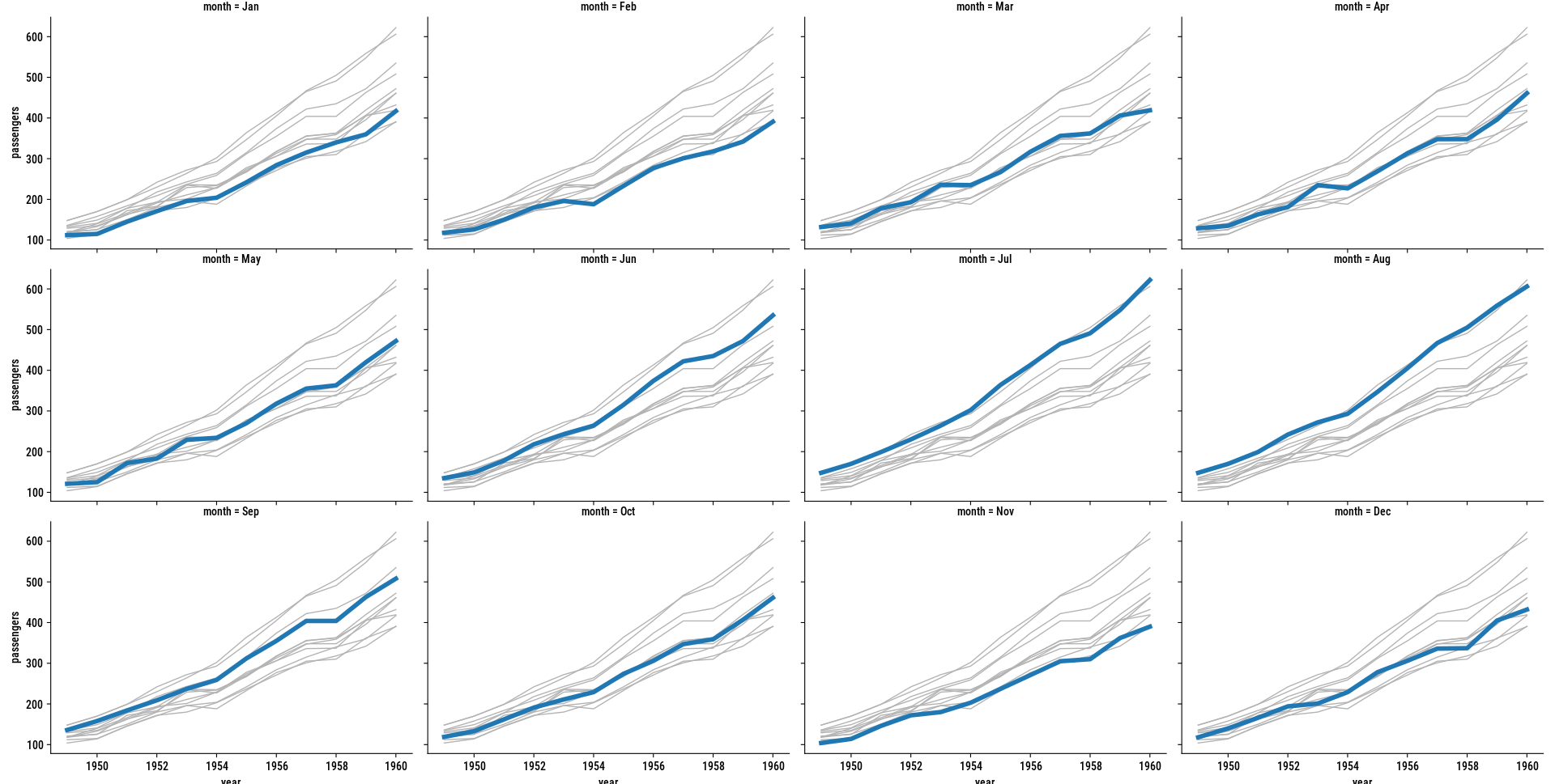
This dataset is basically a data structure we studied in another post. To reproduce our earlier small multiples (see right panel above), we would write:1
g = seaborn.relplot(
    data=flights, x="year", y="passengers",
    col="month", col_wrap=4, kind="line",
    linewidth=4, zorder=5, legend=False
)
for month, ax in g.axes_dict.items():
    seaborn.lineplot(
        data=flights, x="year", y="passengers", units="month",
        estimator=None, color=".7", linewidth=1, ax=ax,
    )
The seaborn.relplot command is used for facetted displays. The on-line doc says that it
provides access to several different axes-level functions that show the relationship between two variables with semantic mappings of subsets. The kind parameter selects the underlying axes-level function to use
In the above example, the same effect could be achieved using seaborn.lineplot instead. There’s a lot more commands in the API, most of them targeting statistical applications (e.g., rugplot, ecdfplot, kdeplot, strippplot, boxplot). Combined with statsmodels and (scipy](https://scipy.org/), I feel like it provides a complete statistical toolbox for newcomers to Python for statistical munging, albeit with less specialized routines compared to R or Stata.
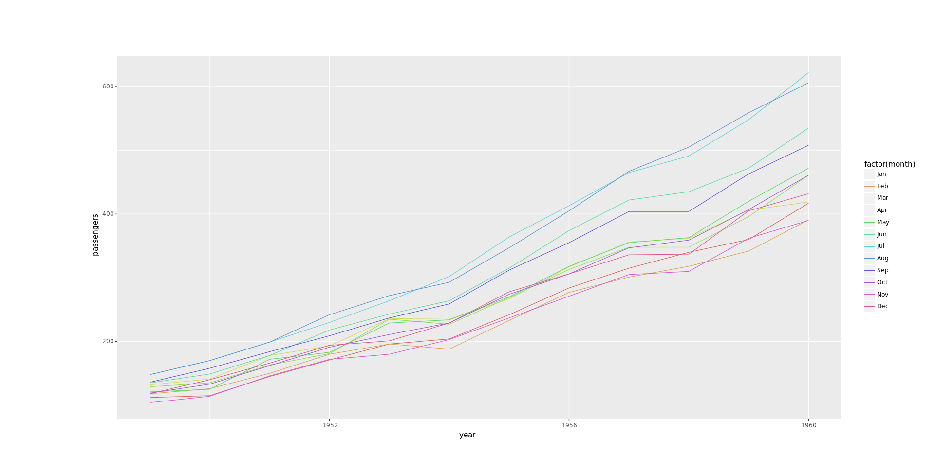
Next to Seaborn, there’s plotnine, which started to be developed six or seven years ago. Its syntax is even closer to ggplot2, so if you’re an R user you may want to start with plotnine directly. For instance, the above plot could be produced as follows:
from plotnine import *
(ggplot(flights, aes("year", "passengers", color="factor(month)")) + geom_line())
Note that you don’t need to call pyplot’s show() in this case. The number of geoms that are currently supported make it a good competitor to other ggplot-like alternative in Python. Actually, the ggplot package looks staled; I haven’t tested lets-plot, and I don’t remember the third option I tried a few years ago but it was nothing compared to plotnine.
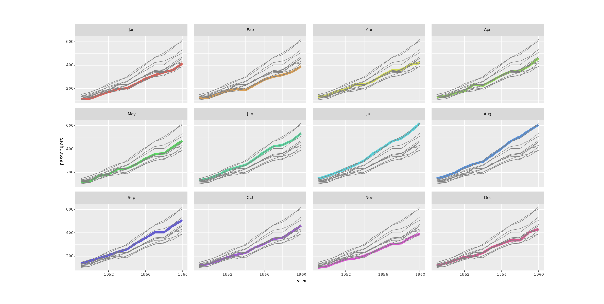
Our facetted small multiples would then be written as follows:
from plotnine import *
flights2 = flights.rename(columns={"month": "mmonth"})
(ggplot(flights)
  + geom_line(aes("year", "passengers", color="factor(month)"), size = 3)
  + geom_line(flights2, aes("year", "passengers", group="factor(mmonth)"), color="grey")
  + facet_wrap("~ month", nrow=3)
  + scale_color_discrete(guide=False))
Allen Downey makes a heavy use of Matplotlib, oftentimes through custom plotting functions. See figure 3 in this blog post for a variant of small multiples that I personally like a lot.
♪ Face The Beat: Session 7 • Dance My darling – Love & Hate
There’s a slightly different illustration of small multiple time series on Seaborn gallery. ↩︎