Venn diagrams and SQL joins in R
When browsing my Tweeter timeline yesterday, I just noticed a post by J.D. Long (@CMastication) who was referring to a nice way of illustrating SQL joins statements with Venn diagrams by Jeff Atwood. So I wonder how it could be reproduced in R.
I initially thought of hacking the venneuler package. However, it happens that I really need a few things, so that I just wrote a wrapper function that takes care of drawing two spheres and shading the appropriate areas. The results actually looks like:
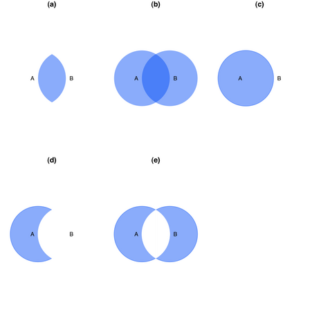
where the five illustrations correspond to the following R code:
# (a) Inner join
merge(tableA, tableB, by="name", all=FALSE)

# (b) Full outer join
merge(tableA, tableB, by="name", all=TRUE)

# (c) Left outer join
merge(tableA, tableB, by="name", all.x=TRUE)

# (d) Records in A, but not in B
res <- merge(tableA, tableB, by="name", all.x=TRUE)
res[apply(res, 2, is.na)[,3],]
# or
# intersect(tableA$name, tableB$name)

# (e) Records unique to A and B
res <- merge(tableA, tableB, by="name", all=TRUE)
res[apply(res, 1, function(x) any(is.na(x))),]
I am not really satisfied with that, and there’s room for improvements, especially in the graphical output. Anyway, I will turn back to it if I had time.
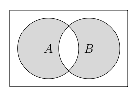
The code is available as Gist 769392. Now, the point is that I still think Metapost, or even Asymptote, would do a better job for such drawings.
So, here is the mp code (thanks to the venn.mp macro):
It is just a matter of running mptopdf on the attached file, venn_demo.mp to produce all five pictures:
$ mptopdf venn_demo.mp
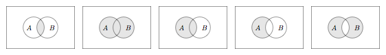
And here is what it looks like using Asymptote (venn_demo.asy):