Yet another gray theme for R base graphics
Among things I like with R is that if you are not happy with default settings, e.g. for graphics, then you can usually update some parameters or make your own plotting function.
For instance, Karl Broman proposed his own theme for base R graphics, with a grey background for the main plotting region (à la ggplot2). He even uploaded a full package to CRAN; see the grayplot() function.
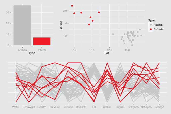
Here is an example of a beautiful R graphical display:

The R code is available on http://www.gradaanwr.net/content/ch12-ensemble-graphics-and-case-studies/. This is certainly the next book I will order on Amazon.com.
While reading Fibonacci Numbers in the Real World, I also found a nice looking scatter plot (see Figure 1). I believe Gnuplot was used to produce this graphic. Here is one way to get started and draw a similar scatter plot using R, where axis ticks are drawn inside the plotting region, and not outside, and with a fine grid added to the plot. I will use a data frame that can be found in the MASS package.
with(birthwt, plot(lwt, bwt, panel.first = grid(nx = NULL, ny = NULL, lty = 1),
                   tck = 0.02)
Of note, when using grid() once a plot is done, the lines will be superimposed on the preceding graphical elements, which is not always convenient. This is the reason why I use panel.first= (see the help for plot.default()) since we do not need to use the option type="n" or call the same function (e.g., hist()) twice (with add = TRUE for the second call). It does not work with the formula interface, though.
p <- function(tck = 0.02, xlab = "", ylab = "") {
  grid(nx = NULL, ny = NULL, lty = 1)
  axis(1, tck = tck)
  axis(2, tck = tck, las = 1)
  axis(3, tck = tck, labels = FALSE)
  axis(4, tck = tck, labels = FALSE)
  minor.x <- axTicks(1) + diff(axTicks(1)[1:2])/2
  minor.x <- minor.x[-length(minor.x)]
  minor.y <- axTicks(2) + diff(axTicks(2)[1:2])/2
  minor.y <- minor.y[-length(minor.y)]
  axis(1, at = minor.x, labels = FALSE, tck = tck/2)
  axis(2, at = minor.y, labels = FALSE, tck = tck/2)
  axis(3, at = minor.x, labels = FALSE, tck = tck/2)
  axis(4, at = minor.y, labels = FALSE, tck = tck/2)
  title(xlab = xlab, line = 2)
  title(ylab = ylab, line = 3)
  box()
}
To draw minor ticks, there’s the Hmisc function, minor.tick(), but it looks like we cannot change the orientation of the ticks (tck =). So, I tried a quick and dirty way to get relevant information from major ticks that are already in place. As always, when I happen to try to implement some code in R, I find a package that already does that, most of the times better than me! See the magicaxis package in this case.
Anyway, the code can be used as follows (without paying much attention to axis labeling):
with(birthwt, plot(lwt/2.2, bwt, axes = FALSE, xlab = "", ylab = "",
                   panel.first = p()))
How about a gray/white theme like the one used in Graphical Data Analysis with R? For another nice theme, see The Code Behind Building a FiveThirtyEight post.
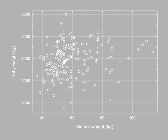
It is possible to set a specific background color when exporting a chart to a PNG file, but not the foreground color. Also, when using par(), the fg= parameter does not control axis color, so we need to set it to white as well.
opar <- par(mar = c(5, 6, 2, 2), mgp = c(3, .35, 0),
            cex.axis = .9, bg = "grey70", fg = "white",
            col.axis = "white", col.lab = "white")
with(birthwt, plot(lwt/2.2, bwt, axes = FALSE,
                   xlab = "", ylab = "",
                   panel.first = p(xlab = "Mother weight (kg)",
                                   ylab = "Baby weight (g)")))
par(opar)
Again, the Hmisc package provides a nice function to arrange axis label, especially in the y-direction; see mgp.axis(). Here, I used a somewhat complicated approach: I called title() to redefine x- and y-label default position (baby weight are displayed using 4 digits, converted as characters, but when setting las=1 R does not increase the space between y-label and y-axis). This cannot be done with par(mgp=) (I only changed the space between lines and units for each axis), and using mtext() is rather cumbersome for that very purpose.

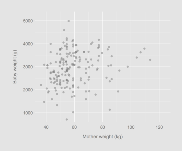
It is not difficult to suppress axis drawing and only use grid lines. Here is an updated version of our helper function (in fact, we could further simplify the first axis() lines since we are not longer concerned with displaying axis ticks):
p <- function(tck = 0.02, xlab = "", ylab = "") {
  grid(nx = NULL, ny = NULL, lty = 1, lwd = 1, col = "white")
  axis(1, tck = tck, lwd = 0)
  axis(2, tck = tck, las = 1, lwd = 0)
  axis(3, tck = tck, labels = FALSE, lwd = 0)
  axis(4, tck = tck, labels = FALSE, lwd = 0)
  minor.x <- axTicks(1) + diff(axTicks(1)[1:2])/2
  minor.x <- minor.x[-length(minor.x)]
  minor.y <- axTicks(2) + diff(axTicks(2)[1:2])/2
  minor.y <- minor.y[-length(minor.y)]
  abline(h = minor.y, v = minor.x, lty = 1, col = "grey95", lwd = 0.5)
  title(xlab = xlab, line = 2, col = "black")
  title(ylab = ylab, line = 3, col = "black")
}
In what follows, I will also change the way x-ticks are built:
opar <- par(mar = c(5, 6, 2, 2), mgp = c(3, .35, 0),
            yaxs = "i", xaxs = "i", cex.axis = .9,
            bg = "grey90", fg = "black",
            col.axis = "grey50", col.lab = "grey50")
with(birthwt, plot(lwt/2.2, bwt, axes = FALSE, pch = 16,
                   col = rgb(.5, .5, .5, .5),
                   xlim = c(32, 128), ylim = c(600, 5400),
                   xlab = "", ylab = "",
                   panel.first = p(xlab = "Mother weight (kg)",
                                   ylab = "Baby weight (g)")))
par(opar)

That’s it!