Stata plot of the week #3
Interaction charts are quite useful to assess the direction and magnitude of an interaction effect in the context of an analysis of variance. Here is one way to build an interaction plot in Stata, using built-in commands only.
The data we will be using come from Montgomery’s Design of Experiments: This is basically a $3^2$ factorial design where we study the effect of temperature (°F) and a design parameter with three possible choices. The aim is to design a battery for use in a device subjected to extreme variations of temperature. I struggled to build an interaction plot for these data while writting my Stata tutorials lately, so I thought it would be a good idea to summarize how I came to a working solution.
Here are the data that we can load into Stata using the folllowing instruction:
import delimited "battery.txt", delimiter("", collapse) varnames(1)
list in 1/3
A two-way ANOVA table can be built using anova:
. anova life temperature##material


                           Number of obs =      36     R-squared     =  0.7652
                           Root MSE      = 25.9849     Adj R-squared =  0.6956

                  Source |  Partial SS    df       MS           F     Prob > F
    ---------------------|----------------------------------------------------
                   Model |  59416.2222     8  7427.02778      11.00     0.0000
                         |
             temperature |  39118.7222     2  19559.3611      28.97     0.0000
                material |  10683.7222     2  5341.86111       7.91     0.0020
    temperature#material |  9613.77778     4  2403.44444       3.56     0.0186
                         |
                Residual |    18230.75    27  675.212963
    ---------------------|----------------------------------------------------
                   Total |  77646.9722    35  2218.48492
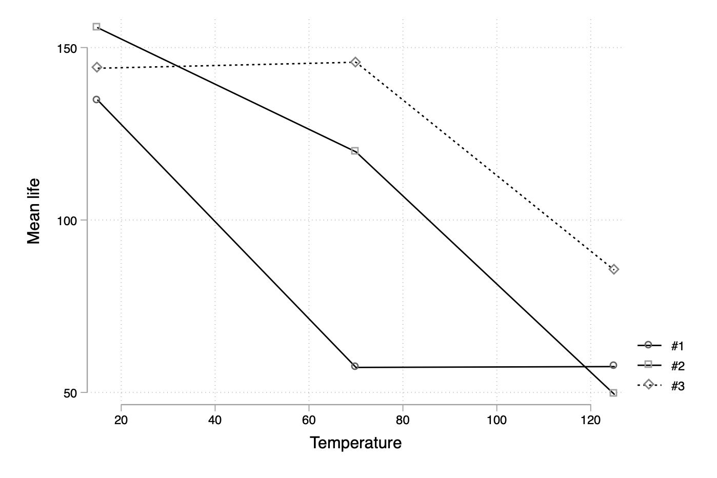
Of course, marginsplot will solve our problem directly, but let’s look at a manual solution. I know that there is anovaplot or even the built-in serrbar command. However, let’s first create summary statistics for our dataset:
preserve
collapse (mean) mean=life (sd) sd=life, by(material temperature)
Now, we could use twoway line instructions using an if qualifier to subset data according to, say, material levels and draw an overlaid scatter plot of means across temperature levels. But let us reshape the data first, after we discarded the previously generated sd variable since we can only reshape one response variable at a time:
drop sd
reshape wide mean, i(temperature) j(material)
twoway connected mean* temperature, legend(label(1 "#1") label(2 "#2") label(3 "#3")) ytitle(Mean life) scheme(plotplain)

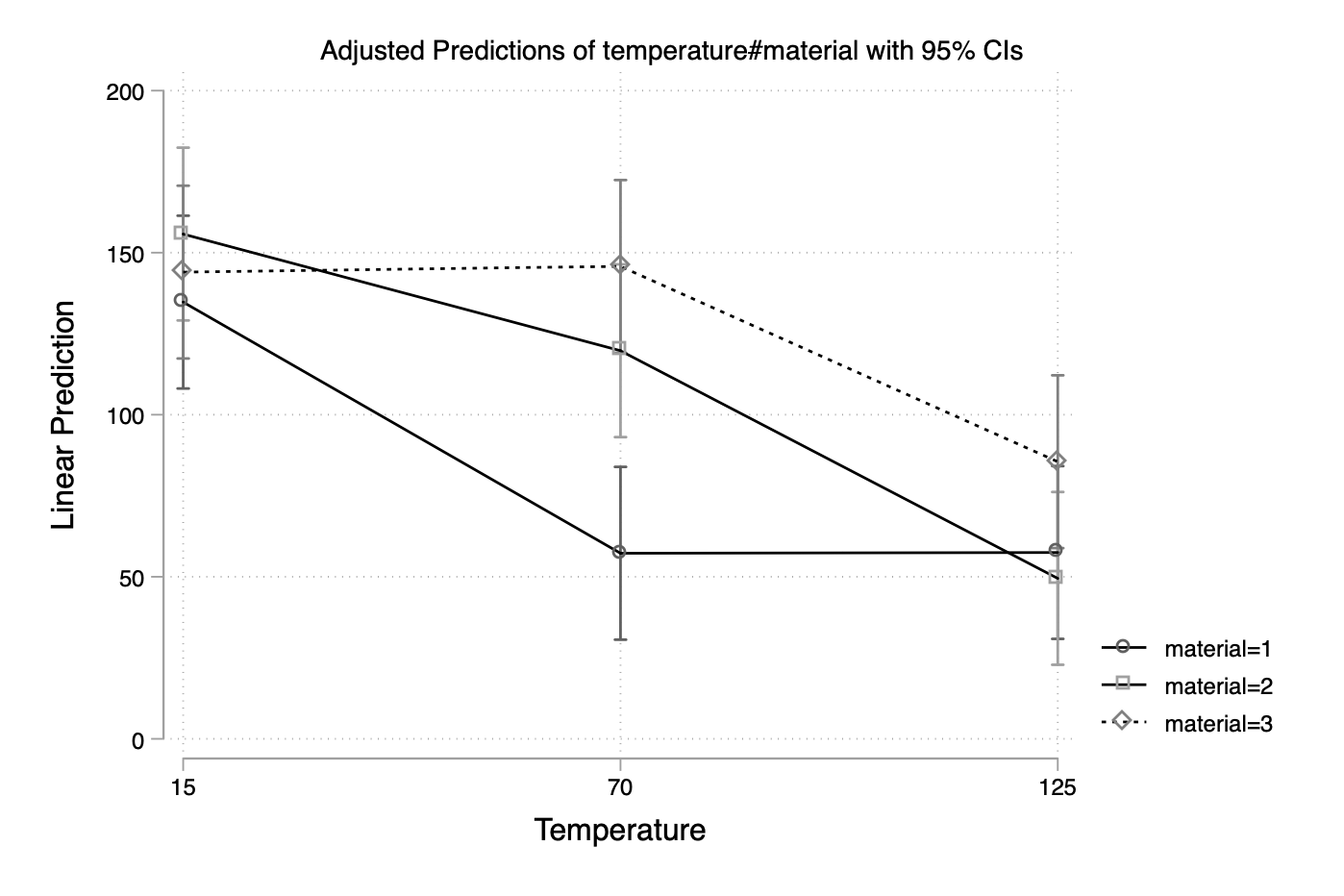
This misses the error bars, though, but I can imagine that adding “low” and “high” values to the current aggregated table and then overlaying the current graph with grouped twoway rcap could be one solution. Again, this is quite overkill since the marvelous margins command will handle all that for us:
restore
margins temperature#material
marginsplot
