Circular displays for contingency tables
Here is an attempt at describing how circular displays, like those proposed by Circos, work and how they can be used to summarize large cross-classification Tables.
A bit of context
I am particularly interested in displaying large association tables in a graphical manner so as to render possible the visual comparison of different results (e.g., in different clinical subgroups, or following different clustering algorithms) and alleviate hard-to-read numerical displays. The basic idea is to be able to display (1) the relative prevalence of each symptom/response and (2) the magnitude of their links. In essence, this is what was proposed by Borsboom and coll. in a recent paper, Comorbidity: A network perspective (BBS (2010) 33: 137–193), that I discussed in an earlier post.
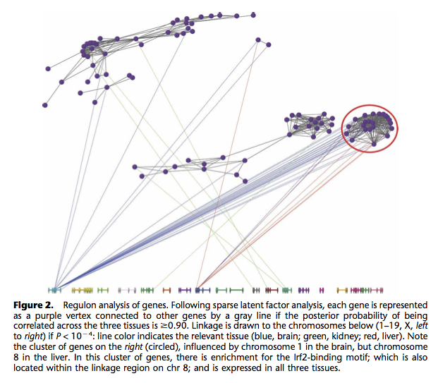
I already know fluctuation plots, as implemented in ggplot2 (ggfluctuation()), or heatmap displays (again ggfluctuation(), or levelplot() from the Lattice package). This would work for (2) essentially. I can imagine that a network or graph representation would also help showing (1) + (2). In fact, similar displays were already proposed to study genes networks, as in the following picture taken from The influence of genetic variation on gene expression, from Williams et al., Genome Research (2007) 17:1707.

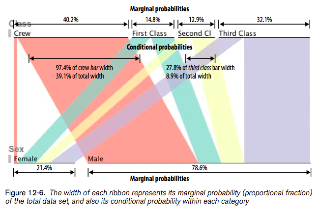
In Beautiful Visualization, Looking at data through the eyes of experts (Steele and Iliinsky, eds., O’Reilly, 2010), Robert Kosara shows how to turn a Table into a tree with Parallel Sets (Chapter 12). His paper is available online: Robert Kosara, Turning a Table into a Tree: Growing Parallel Sets into a Purposeful Project, in Steele, Iliinsky (eds), Beautiful Visualization, pp. 193–204, O’Reilly Media, 2010.
Here’s what it looks like:

Another paper that I liked is Aritra Dasgupta, Robert Kosara, Pargnostics: Screen-Space Metrics for Parallel Coordinates, Transactions on Visualization and Computer Graphics (Proceedings InfoVis), vol. 16, no. 6, pp. 1017–1026, 2010, but we shall concentrate on circular displays for the moment.
Contingency tables as graphs
Basically, the idea is to show the relationships among categories of two or more variables arranged in a contingency table. Then, after realizing that a contingency table is nothing more than a weighted graph, whose vertices are the categories and the edges are individual cells, we can display it as we would do for a graph. The trick is to impose some structure on the display, and in fact, it is easy to come to the idea that we can draw it in polar coordinates.
Let’s look at an example. First, we generate some artificial bivariate data:
s <- cbind(A=sample(letters[1:4], 100, replace=TRUE),
           B=sample(letters[1:2], 100, replace=TRUE))
( s.tab <- table(s[,1], s[,2]) )
prop.table(s.tab)
# or we could use:
# margin.table(s.tab, c(1,2))
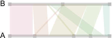
Now, here is how it looks when we draw those linear relationships as “ribbons” whose size reflect conditional associations:

So far, so good. We got the idea, but as we generate data from uniform distribution, no relations are to be expected between the categories of A and B. This is indeed the case and there’s no apparent “pattern” in those ribbons, and the points on the A-segment are evenly spaced. So, let’s try with a more unbalanced two-way table:
s2 <- as.table(matrix(c(23,14,2,14,2,25,15,5), nc=2))
And here is flat display:

Clearly, a more interesting pattern can be seen there. First, nearly all of the first category of A is linked to the first category of B. Second, this kind of picture clearly highlights close-to-empty cells (s2[3,1] and s2[1,2]).
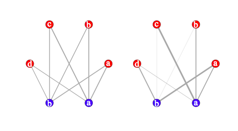
It’s quite easy to compare the above results with that obtained from a graph-based approach:
library(igraph)
s.g <- graph.incidence(s.tab, weighted=T)
plot(s.g, layout=layout.circle,
     vertex.label=c(letters[1:4],letters[2:1]),
     vertex.color=c(rep("red",4),rep("blue",2)),
     edge.width=c(s.tab)/3, vertex.size=20,
     vertex.label.cex=3, vertex.label.color="white")
The first table is shown below on the left; the second table is on the left. Clearly, this is close to the preceding pictures (we could even have arranged vertes on a rectangular grid):

Building circular displays à la Circos
Warping the above pictures onto a circle is basically what Circos actually does, although computation are largely more optimized than mine. For the same data, Circos produces the kaleidoscope displays shown below. Here are the sample data if one wish to try it online with the Table Viewer (space a separator, mixed row and column labels): circos_tab1.txt, circos_tab2.txt.
Our first table now looks like the display on the left, whereas in the second (unbalanced) case, the panel on the right nicely highlights the small cells:

