Monochrome color scheme
In the previous post I described how I moved to a tiling window manager on macOS (Mojave). In passing, I mentioned the opinionated view of Joshua Stein regarding color scheme, or rather “no color” scheme. While browsing his Github I found some of his config files, especially his color scheme for Vim. I can confirm that it is just black on white, with occasional highlighting using bold or underline. Up to now, I’ve been devising my own color scheme using Doom’s macro custom-set-faces!. I talked about my dark theme (Nord) settings two months ago. Recently, I became interested in switching to a light theme, both for my text editor and terminal.
I’m using the Kitty terminal emulator and it is quite easy to customize the appearance of font and colors. I like that ligatures are working right away (I’m now using JetBrains Mono). As I didn’t want a full white background, I choose a tinted color (#f0eee4), which means that I need to override default background color when using Emacs Doom themes. Not a big deal, but I prefer the way Vim manages its default background in console mode. Anyway, this worked great and I’ve been using my new settings for a week or so. In addition to changing the default theme form dark to light, I also simplified my color scheme and came to something close to a duotone-like color scheme: all but constants (strings and numbers) in black, yellow for region or line highlighting, and red for Flycheck and Flyspell errors.
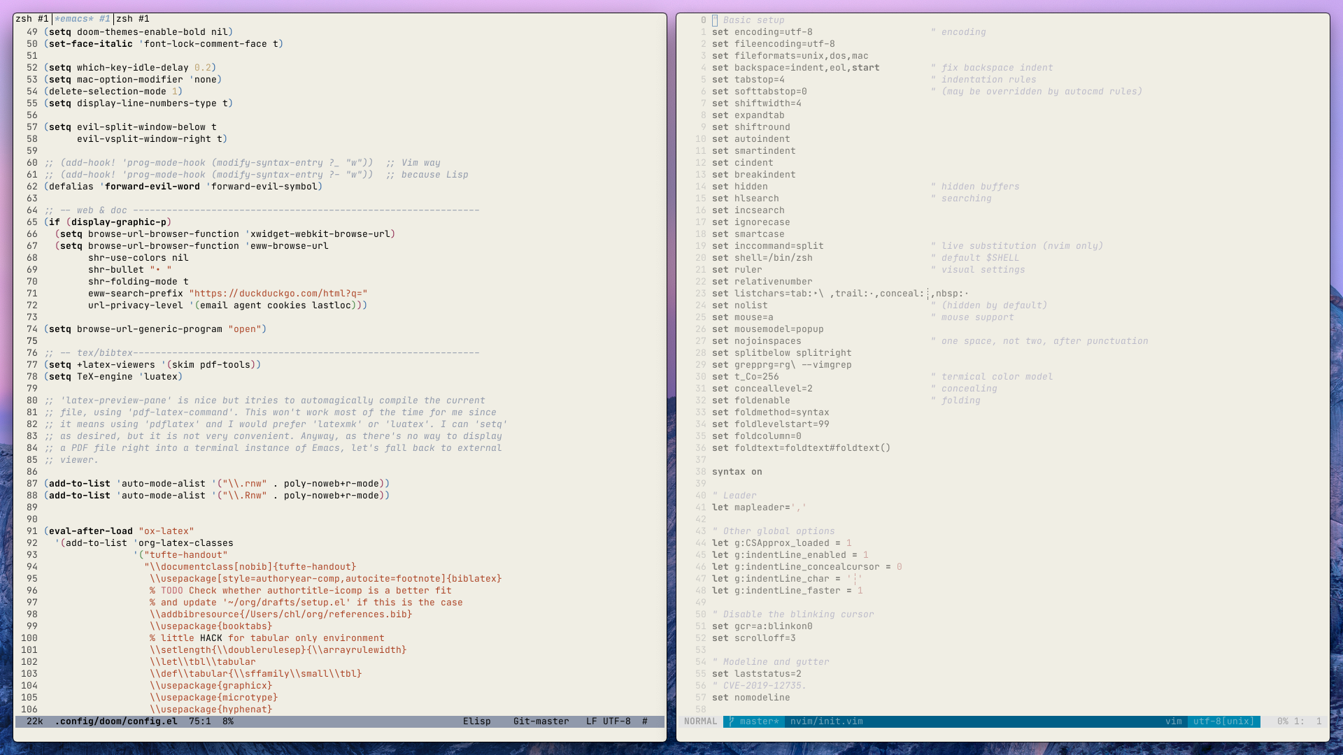
Below is a screenshot of my current desktop: Emacs and Vim, side by side, using an almost consistent duotone-like color theme for both.

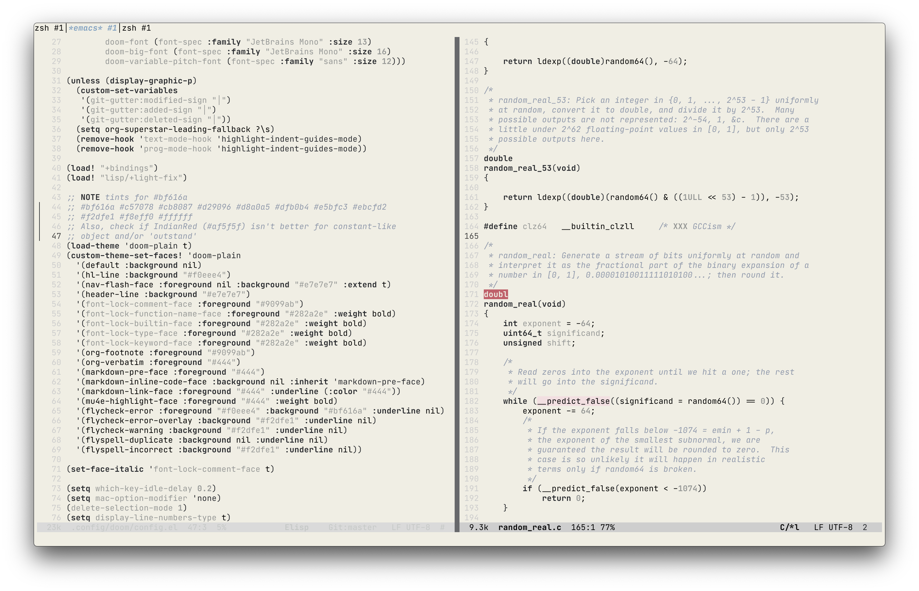
While I was quite happy with these settings, this means I had to override a lot of default font-lock and face settings in Doom Opera Light theme. I know custom-theme-set-faces! is way better than custom-set-faces! for that purpose, but the problem really is that I don’t need all those colorful features. Here comes the Doom plain theme, which landed on Github a few days ago, and it is just what I needed to finalize my new color scheme. For the moment, I kept most of the default settings, which happen to be a tinted black and various grey schemes, and just updated the way errors and visual line are highlighted, as well as “font-lock” for core language elements (all in bold). Also, comments are highlighted using a different color than the base grey used elsewhere to make them standout a little (as suggested by Nikita Tonsky). I left constants (strings and numbers) as is, that is in grey, but maybe I will revert to my old settings at some point. I use almost the same settings for Vim, which means that whatever text editor I decide to use I will get the same visual feedback. Here is how it looks for Emacs Lisp and C files (in terminal mode):
