Visualizing results from SQL queries
Most statistical or dedicated software can process data stored in SQL databases and plot results from specific queries. There are also custom applications that allow to display query results, like DbVisualizer.
I recently installed a full-featured binary package of PostgreSQL, Postgres.app, which I find particularly convenient to work with database on my Mac since it generally comes with an up to date Postgres system, as well as PostGis and PLV8 (which I haven’t explored yet). From the same author, there is also a nice GUI for querying and visualizing results as basic charts (actually, points or lines scatterplot, and donuts, i.e. much less features compared to DbVisualizer): Induction. The list of upcoming features looks really impressive although I doubt all tasks will be completed tomorrow. Anyway, that’s an interesting project because there are several connectors (PostgreSQL, Redis, sqlite and MongoDB) and it is just free.
To connect to a running Postgres, just enter the following information
postgres://chl@localhost:5432
This is just your login name, followed by the host and port where the server is running.
A toy example
I will used the auto dataset which I saved as a plain text file on my hard drive. Here is a brief sketch of the SQL statements: (This assumes there is a database named datasets.)
chl=# \c datasets
datasets=# CREATE TABLE auto (MAKE char(20), PRICE real, MPG real, REP78 real, HEADROOM real,
                              TRUNK real, WEIGHT real, LENGTH real, TURN real, DISPLACEMENT real,
                              GEAR_RATIO real, FOREIGNER real);
datasets=# COPY auto FROM '/Users/chl/Documents/data/auto.txt' DELIMITERS ',' CSV HEADER;
datasets=# SELECT make FROM auto WHERE rep78 = -999;
datasets=# UPDATE auto SET rep78 = NULL WHERE rep78 = -999;
datasets=# SELECT * FROM auto LIMIT 5;
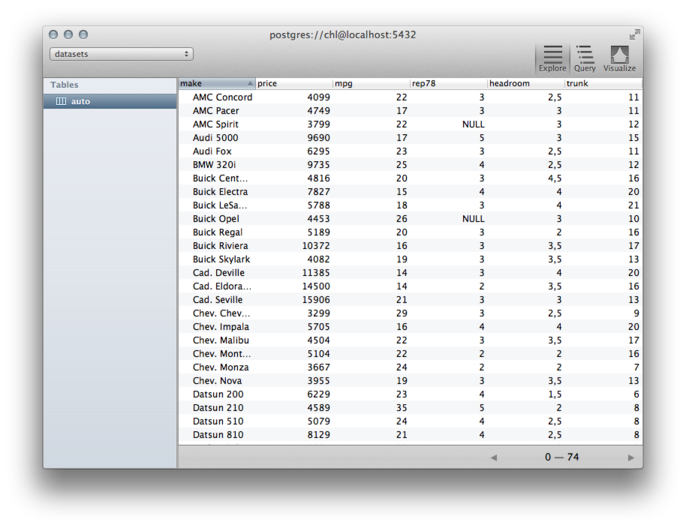
Here is the table viewed from Induction:

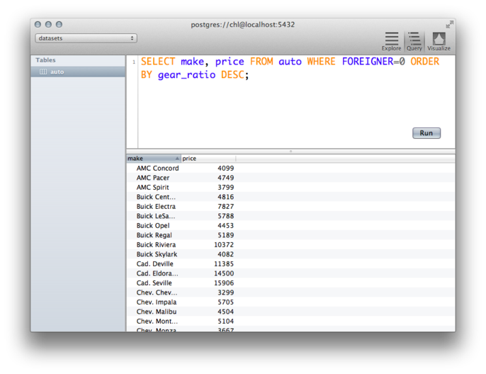
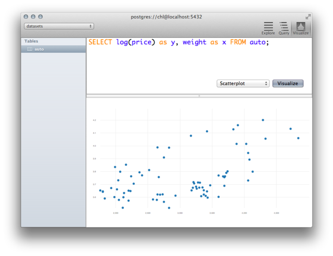
And here is a little query (with syntax highlighting and auto-complete), on the left, and a simple scatterplot (nothing fancy, of course), on the right:
The plotting framework is held on a separate Github repository: LiesDamnedLies and I noticed it included a D3 backend, but for the moment data visualization remains static. I hope this open source project will go beyond the alpha stage because it might well be a handy and free alternative to existing software (e.g. DbVisualizer at $179/year).
Sidenote
There are certainly a ton of papers dealing with visualization of database queries. I found some old work from the Stanford Graphics group,
- Stolte, C., Tang, D., and Hanrahan, P. (2002). Query, Analysis, and Visualization of Hierarchically Structured Data using Polaris.
- Stolte, C., Tang, D., and Hanrahan, P. (2008). Polaris: a system for query, analysis, and visualization of multidimensional databases. Communications of the ACM 51(11): 75-84.
Also, one can find a lot of communications or abstracts on visual query language (e.g. Databases will Visualize Queries too by Wolfgang Gatterbauer, but see http://queryviz.com) which has nothing to do with what I was looking for! Other solutions include embedding some JS backend into your database system, like in Visualize Your Oracle Database Data with JFreeChart. There’s also Google Chart Tools but this is probably another story.

