Visualizing data using tag cloud
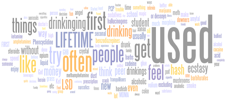
Tag cloud consists in a layered plot of words where font size is proportional to word’s frequency. The challenge is to arrange each element in a coherent and elegant layout. Nowadays, tag clouding is available in many SDKs, including Google Viz. API, see WordCloud. However, few offer the quality that is found using on-line generator like Many Eyes or Wordle.
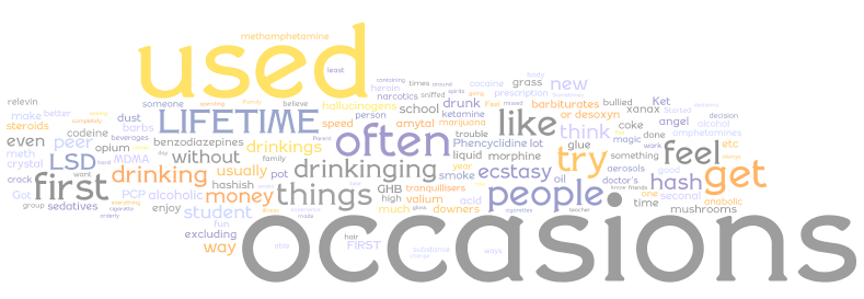
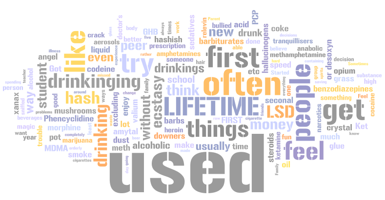
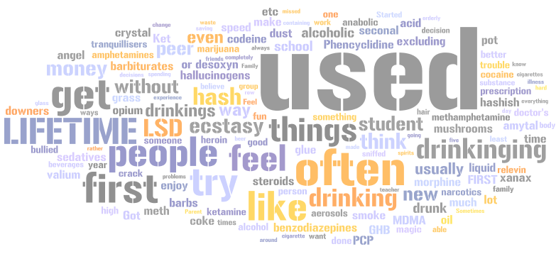
Here are some examples I’ve built myself, although I’ve tried many layouts and fonts.
Recently, I came across the website of Yihui Xie (who creates the R animation package) and its wonderful tag could in Flash.
Here are the solutions I tested within R. First, using the cloud() function in the snippets package (available on R-Forge).
library(snippets)
txt <- tolower(scan("all_cut.txt", what="character"))
# filter some irrelevant tokens
txt <- gsub("([.]|[()/]|[0-9]*)","",txt)
# remove infrequent word or of length < 4
txt <- txt[nchar(txt)>3]
wt <- table(txt)
wt <- log(wt[wt > 8])
cloud(wt, col = col.br(wt, fit=TRUE))

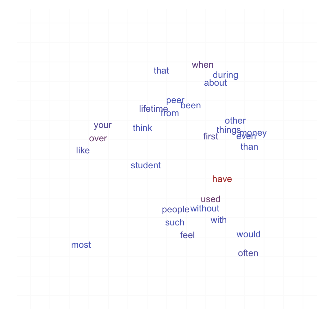
Then I tried to arrange the (x,y) layout, by randomly assigning words to distinct spatial locations. I also tried a 3D layout, where words lie on a sphere:
library(ggplot2)
xy <- as.data.frame(cbind(replicate(2, runif(length(wt))),as.numeric(wt)))
dimnames(xy) <- list(names(wt),c("x","y","freq"))
theme_set(theme_bw())
p <- ggplot(xy, aes(x=x, y=y, label=rownames(xy), col=exp(freq)))
p + geom_text(fontfamily='Fontin') + xlim(c(-.2,1.2)) + ylim(c(-.2,1.2)) +
    labs(x=NULL, y=NULL) + opts(panel.border=theme_blank(),
    panel.grid.major=theme_blank(), axis.ticks=theme_segment(size=0),
    axis.text.x=theme_text(size=0), axis.text.y=theme_text(size=0),
    legend.position="none")
Graphics and animation rely on the rgl package. Color palette reflects actual word’s frequency and the (x,y,z) coordinates are computed very crudely using this function:
set.coord <- function(char) {
  n <- length(char)
  x <- y <- z <- numeric(n)
  for (i in 1:n) {
    alpha <- runif(1, 0, 2*pi)
    beta  <- runif(1, 0, 2*pi)
    x[i] <- radius*(-cos(alpha))*sin(beta)
    y[i] <- radius*cos(beta)
    z[i] <- radius*sin(alpha)*sin(beta)
  }
  return(list(x=x,y=y,z=z))
}
The algorithm originally used at http://www.wordle.net/ is described by the author himself in a reply to a post on stackoverflow. Basically, it is implemented using Java API as follows:
- Count the words, throw away boring words, and sort by the count, descending.
- Keep the top N words for some N. Assign each word a font size proportional to its count.
- Generate a Java2D Shape for each word, using the Java2D API.
- In decreasing order of frequency, do this for each word:
place the word where it wants to be
while it intersects any of the previously placed words
    move it one step along an ever-increasing spiral
Here is a short and lighter implementation using Nodebox.
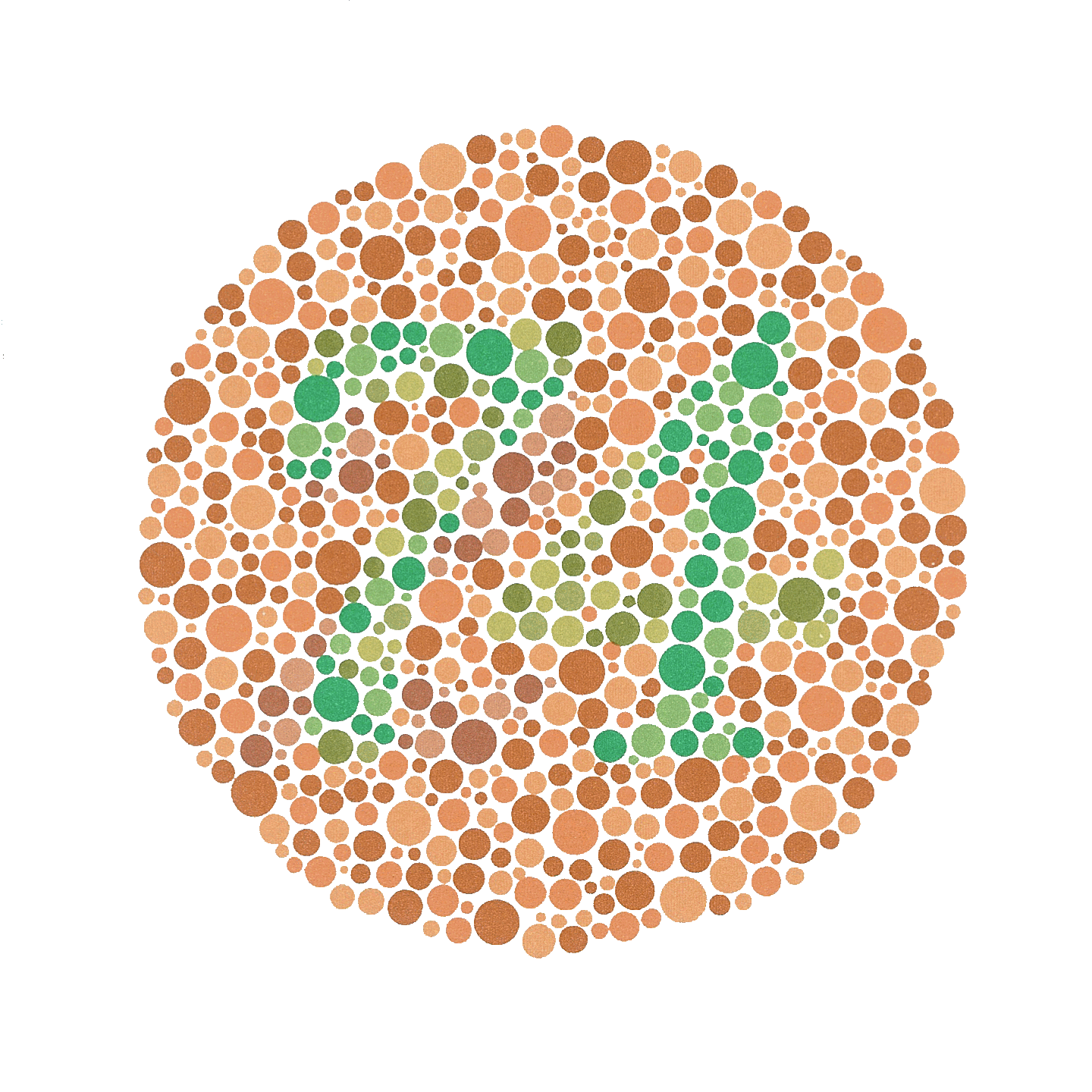
Finally, I realized that there is a huge amount of discussion on how to best represent tags, or more generally how tagging information can be used to display useful information about web traffic, text content, but see this post. In the same vein, such approach may be used to reproduce Ishihara’s plates, but see Ishihara color test.
